Fortunately, there is a way to turn your valuable data into compelling visuals and reports that will give you instant insights into your business with an easy-to-use tool that will revolutionise the way you use your data.
Simplifying Complex Data
Your business most likely has all kinds of data and use it in many way such as to:
- Measure past performance of employees, manufacturing, and sales
- Measure current performance of employees, manufacturing, and sales
- Project future performance of employees, manufacturing, and sales based on trends
- Understand the company’s role in the marketplace
- Look at the marketplace and how it is changing and may change in the future
- Identify areas that are performing well and areas that need improvement
- Study KPIs and trendlines
- Understand what has led to past or current successes and failures
All this data provides vital information. Many of you can easily create spreadsheets and explain the numbers, but you cannot always bring the stories behind the data to life.
This is where tools like Microsoft Power BI can help you organise data to gain valuable insights. Power BI allows professionals and businesses to create visuals, reports and dashboards that can be shared with key stakeholders and decision-makers for a fresh take on achieving your strategic goals.

Related Link: Enlighten Designs Named as a Finalist for the 2022 Microsoft Power BI Partner of the Year Award
The Power of Power BI
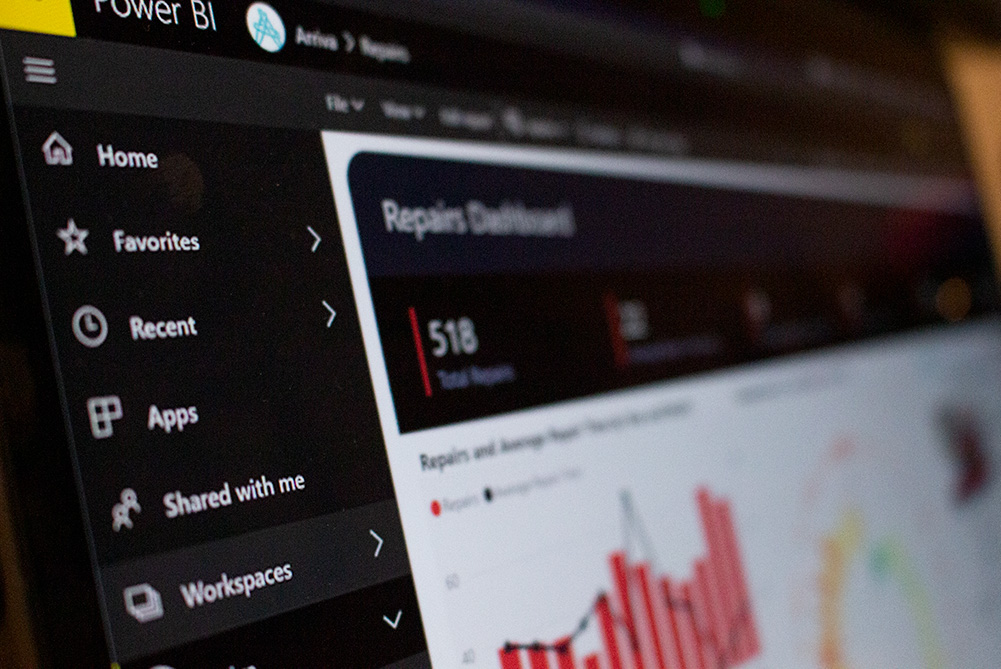
Power BI makes data visualisation and reporting super easy and simple. By integrating different data sets into one cohesive report, making sense of all key data and metrics is straightforward. As a result, you can explore the relationship between the various data points and use your time responding to the insights uncovered in the data to make those crucial decisions.
Power BI Dashboards further help by providing handy snapshots of the most important and relevant information. By collecting the visuals in one place, users and key stakeholders can engage and interact with the data and provide high-level context.
Case Studies
Enlighten’s client portfolio includes non-profits working to fight poverty, manufacturers tasked with ensuring on-site worker safety, charities working for the environment, and large health care. We have been able to develop a scalable, repeatable process of education and empowerment for each client to unlock the power of Power BI both for their own benefit and for the benefit of their customers and stakeholders.
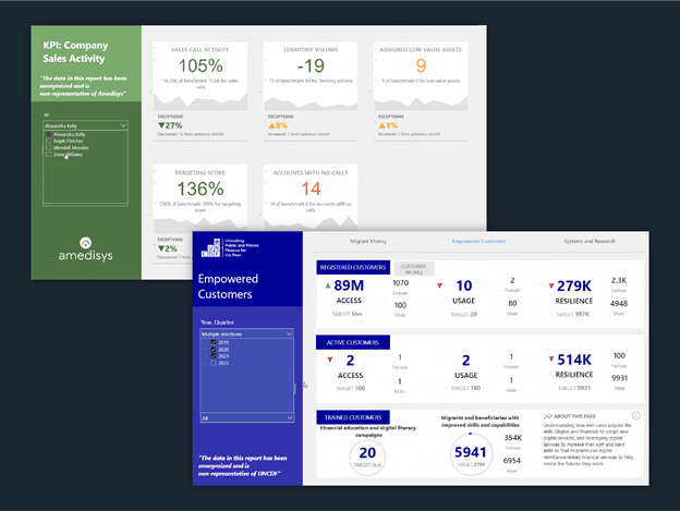
- Through our hallmark Discovery & Design workshops, we set up multiple reports for the United Nations Capital Development Fund (UNCDF), with the most recent involving support for their Key Performance Indicators (KPI) and Enterprise reporting. As a result, UNCDF were able to fine-tune the reporting that underpins their vital work on eradicating poverty – activities that reverberate throughout the world as the funding of capital development impacts communities everywhere.
- We also worked with Amedisys, Inc., a large, aged care sector player in the United States. Whilst they had used Power BI previously, they called upon Enlighten Designs to create KPI reports that would allow them to visualise their data to complement and enhance their existing processes. With these instant snapshots of relevant metrics, they are now able to identify trends, focus on new sales opportunities, and adapt their offers to the market more quickly than ever.
- Further, Enlighten Designs collaborates with the talented team at Blackline Safety to support their data capabilities. This involved assisting them with some custom visuals and tools to bridge the gaps with available Power BI visuals for better reporting, which ultimately contributes to improving worker safety and better productivity for Blackline's clients. Through this partnership, Enlighten has also been able to learn and grow our Power BI competency, while being part of work that directly impacts lives.
Conclusion
If you’re ready to test it out, learn how to create your very own Power BI report in less than 5 minutes!