What's the Difference Between Data Visualisation and Data Storytelling?
What’s the difference between data visualisations and data storytelling? They’re actually closely related and work together.

When it comes to sharing information, what’s the best way to do it? We hear quite a bit about data storytelling and data visualisations, but what’s the difference between them? Is one better than the other?
In this post, we’ll explore what data visualisations and data storytelling are, why they’re important, and how you can use them to engage audiences and help them make the right choices based on data.
How Do You Use Statistics to Wow Your Audience?
Before we discuss the definitions of data visualisations and data storytelling, let’s look at statistics and how marketers can use them to grab audiences’ attention. At Enlighten Designs, our team lead, Verne Roberts, has a metaphor to describe the importance people place on statistics: Let's say you collect 100 clams, and out of those 100 clams, you have a single pearl. You might be quite pleased with yourself that you've collected 100 clams, yet what other people will care about is that one pearl.
Data storytelling, and data visualisation by extension, is how you share your data with your audience in a way that resonates.
What Is Data Storytelling?
Data storytelling is a way to make sense of information so that your audience keeps paying attention to what you’re telling them. When you use data storytelling, you’re explaining why those numbers matter; it gives them real meaning. Being able to explain why data is important is part of data analysis, too.
Once you understand why a given set of statistics matters, you can figure out what you should do with that information. With data storytelling, you gain deeper insight into your information, and it’s the first step toward taking the right action.
What Are Data Visualisations?
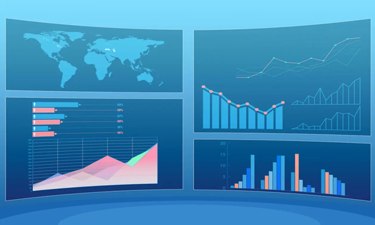
A data visualisation is a way of conveying information through an image. Data visualisations are a highly effective way of grabbing audience attention.
The human brain was built to process visual images. In fact, half of it is involved in processing visual images. That’s why if you see information conveyed via text (like in this sentence), you’re less likely to remember it than if you saw data displayed in a bar graph.
What’s the Relationship between Data Storytelling and Data Visualisations?
Now that we’ve explored what data storytelling and data visualisations are, let’s look at how they’re different and how they’re ultimately related.
The best way to think of data storytelling is that it’s a strategy for sharing information in a way so that people can understand it. Data visualisations, on the other hand, are a tactic of data storytelling; you use them to paint a picture with your numbers.
“Data storytelling is a strategy, while data visualisations are a tactic.”
Data storytelling and data visualisations aren’t diametrically opposed ideas. Rather, they’re meant to work together to help decision makers choose the best course of action for an organisation. You use data visualisations to bring data storytelling to life, so audiences understand why they should pay attention to your numbers, and understand what they can do about the problem.
Real-world Examples of Data Storytelling and Data Visualisations at Work
There are two real-world examples of data storytelling and data visualisations that Enlighten Designs has brought to life:
- Port Otago
- Sustainable Coastlines
Port Otago
Port Otago is the primary port on New Zealand’s South Island. Every year, the port hosts over 450 vessels (including cruise ships), and over 1.7 tonnes of conventional cargo move through there annually. One of the challenges Port Otago faced is that its upper harbour is only 7.5m deep, so bigger ships are limited to one wharf. The port authority needed to know what ships were coming in, how long they would stay, and how to best mitigate complications and risks. The spreadsheet system they were using wasn’t getting the job done.
Enlighten Designs created a visual forecasting tool that not only shows how busy the port is now, but also provides accurate and interactive data about past and future traffic at the port. The data visualisations give managers a top-down view of the port, which allows them to see any potential overlaps or collisions, even years in advance. Since the solution was implemented, employees have been enthusiastic about its ease and efficiency. Managers note that employees are more engaged and are thinking about new ways to improve port operations.
Sustainable Coastlines
Sustainable Coastlines is an Auckland-based charity with national operations. The organisation’s goal is to enable Kiwis to safeguard coasts and waterways from pollution. One of Sustainable Coastline’s projects was empowering citizen scientists around the country to collect data on marine litter. The challenge the nonprofit faced was digitsing the data collection process and then allowing it to be explored so that it could be presented to bodies such as the UN.
Enlighten Designs created an app so that citizen scientists could easily add the information they collected to a database. Once the app was refined, Enlighten developed a website that would act as a central point for the entire project. The website would expose the data as well as provide a platform to present insights and actions to help solve the marine litter problem.
“The website provides a platform to present insights and actions to solve the marine litter program.”
Sustainable Coastlines reviewed data gathered about beach litter and discovered that the City of Wellington's beaches had the highest amount of plastic straws in the country. With that information, the organisation approached the municipality with news of the problem. As a result, Wellington banned plastic straws, reducing that type of litter on its beaches.
In October 2019, Enlighten won the Microsoft NZ Partner Award for Cloud for Good, a prize that recognises Microsoft partners that create solutions to make New Zealand a better place. Enlighten Designs and Sustainable Coastlines continue to work together to refine data insight reports.
Enlighten Designs: Effectively Using Data Storytelling and Data Visualisations
Since 1998, Enlighten Designs have created amazing digital experiences to delight audiences, including data visualisations based on compelling data storytelling. Our knowledge and expertise in data have enabled us to tell fantastic stories with information through eye-catching visualisations. To learn more about how data storytelling and data visualisations can work for you, contact us.